Separate the Style from the Board Construction
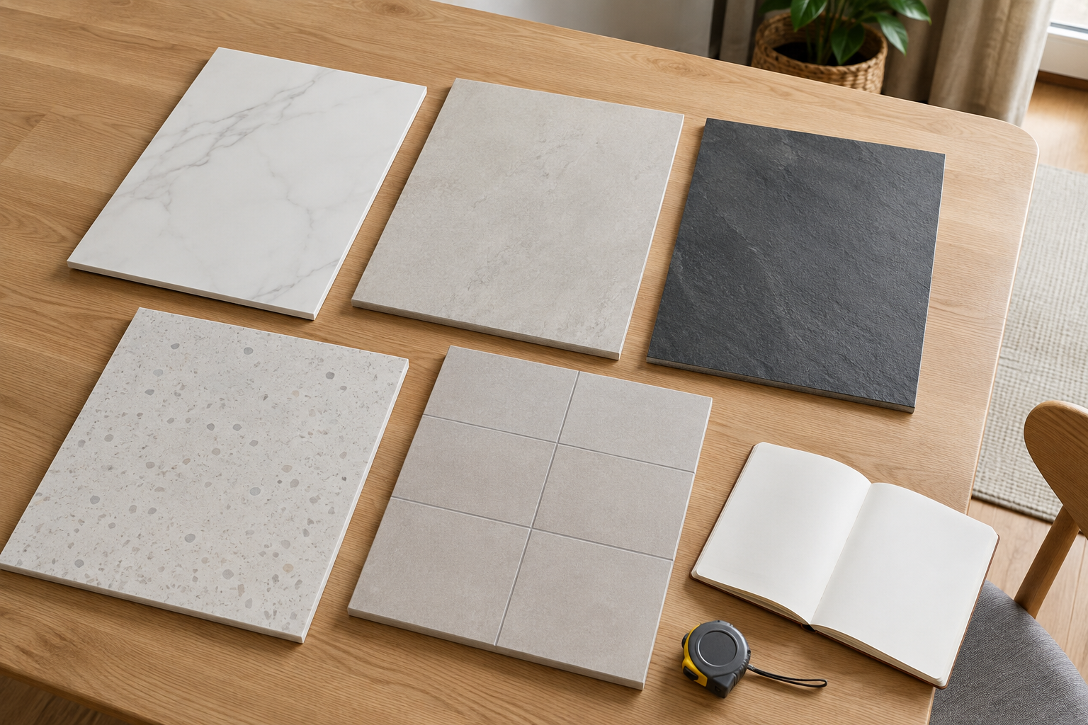
Marble, stone and tile effect describe the appearance of a panel, not necessarily what it is made from. Similar designs can be printed on different board types with different joints and fitting requirements. Start by choosing an appearance you like, then check the exact product’s suitability for your bathroom. A style label such as luxury or natural does not establish quality or performance. Ask for the range, construction and instructions alongside the sample. This keeps the decorative decision connected to the system that will actually be fitted around your shower or bath.
Marble Effects and Larger Vein Patterns
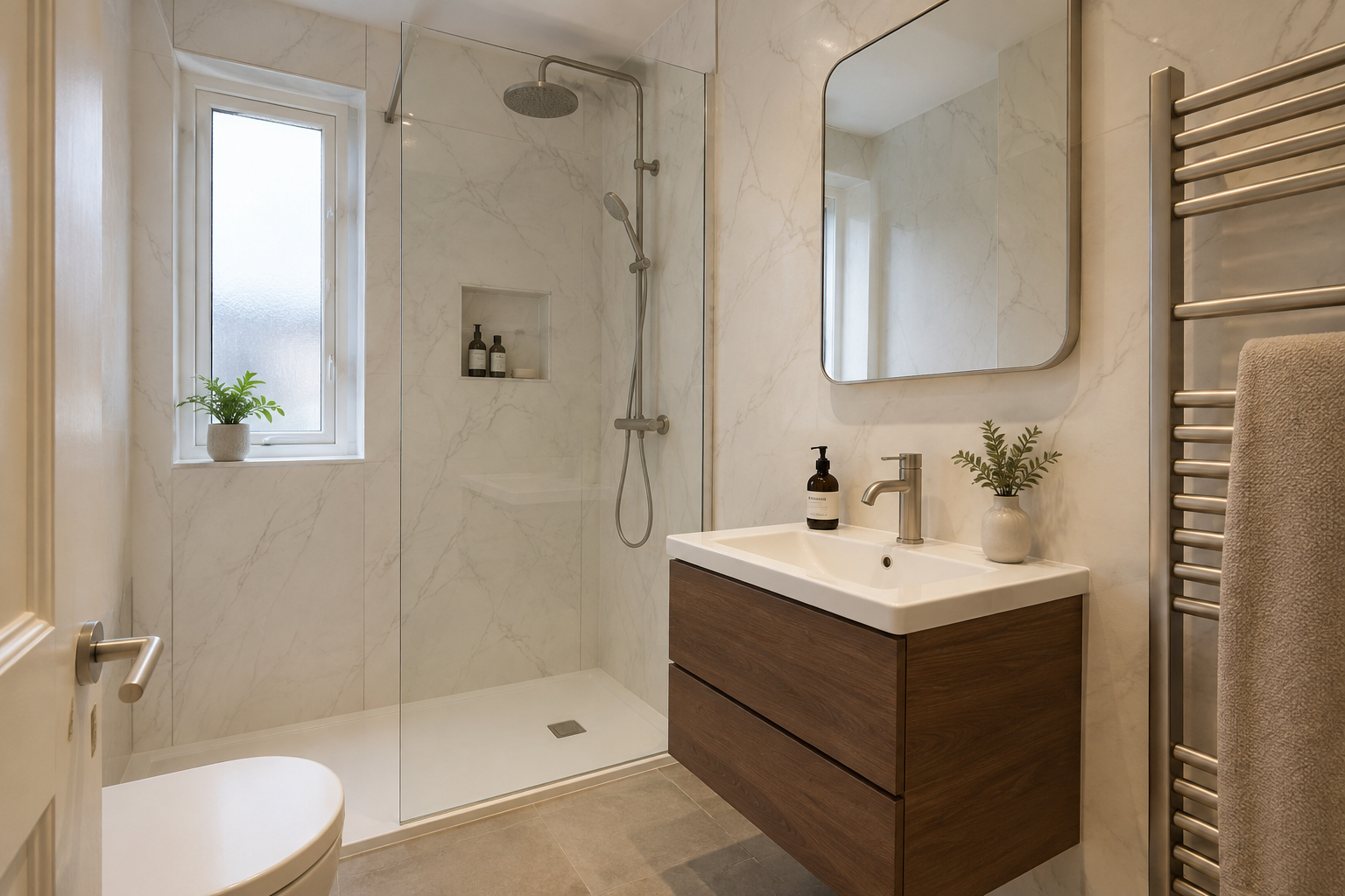
Marble designs range from fine grey lines on a pale background to bold, strongly coloured veins. Look at the whole board because a small sample may show only a quiet section. In a compact room, the pattern may be interrupted by the mirror, screen and window. Ask where joins will fall and whether the range is designed to align in a particular way. A simpler floor can make a stronger wall pattern easier to combine with furniture. The right choice is the one you enjoy across the actual wall, not simply the most dramatic sample.
Stone and Concrete-Look Finishes
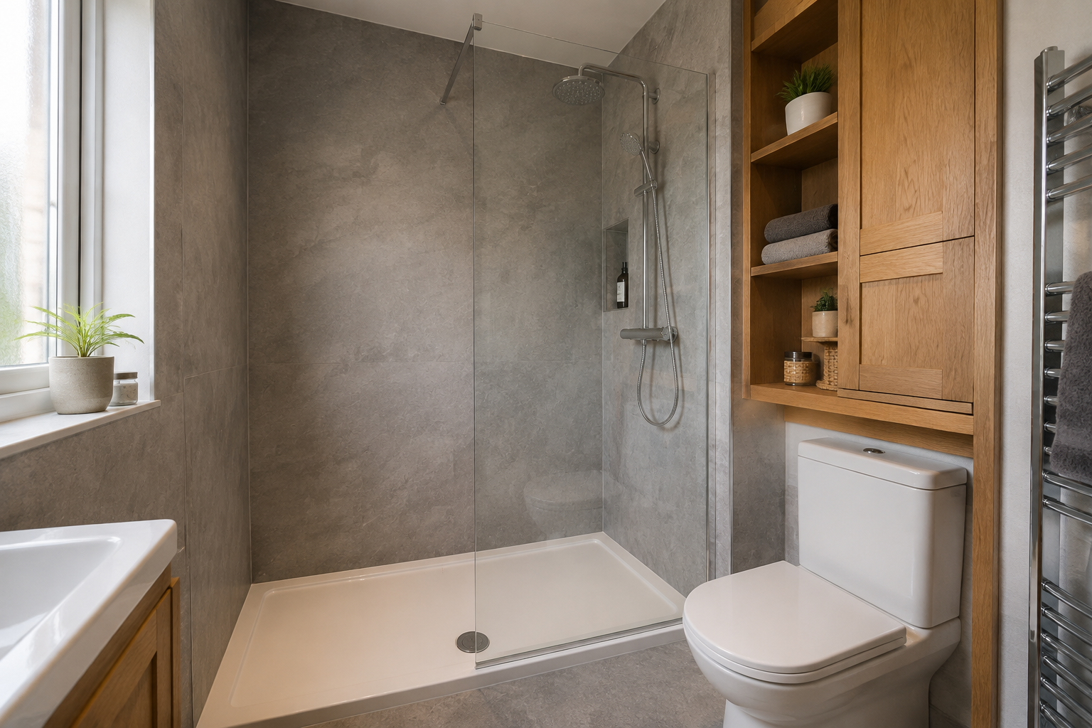
Stone effects can include pale limestone, warmer beige tones and deeper slate colours. Concrete designs often have a less obvious pattern but can still vary between warm and cool greys. Compare them beside the floor and vanity under your bathroom lights. A lightly textured face may look different from a smooth one even when the printed colour is similar. These finishes can suit both modern and more traditional fittings, depending on the combination. Do not assume the panel has the weight, feel or care needs of real stone or poured concrete just because it imitates their appearance.
Tile Effects with Fewer Real Joints
Tile-effect panels carry a tiled design across a larger board. The printed or formed lines give a familiar pattern without separate grout joints between every apparent tile. There are still board connections and seals around the edges to maintain. Check the size and colour of the tile lines across the whole wall, especially around corners. A strong grid can compete with patterned flooring or a framed shower screen. Ask how the layout will keep the lines looking deliberate. A product picture of one flat wall may not show the cuts needed around your bath, window and controls.
Terrazzo and Sparkle Designs
Terrazzo effects use a flecked or chipped pattern, while sparkle finishes catch light in a different way. Fine terrazzo can add detail without a large vein design; bolder chips may be more noticeable in a small room. Sparkle should be viewed under both daylight and the room’s artificial lighting. Compare the full effect before deciding on coverage across every wall. A plain floor or vanity can help balance a busier finish. These styles are matters of preference, but their scale and lighting response should be checked in the actual bathroom rather than guessed from a thumbnail.
Wood and Slat Effects
Wood-look panels can add a timber appearance beside plain or stone surfaces. Some designs are printed grain; others have a slatted or moulded look. The exact product must be suitable for the position where you want it, particularly inside a shower. Decorative sound-absorbing slats are not automatically a wet-area wall system. Compare the wood tone with the vanity and floor so several similar but conflicting shades do not dominate the room. Plan grain direction and cut pieces around corners. A sample should help you understand both the appearance and the surface you will need to clean.
Plain Colours and Surface Shine
Plain panels can give the fittings, floor or furniture more attention without adding another pattern. White, neutral and stronger colours all need checking under the room’s lights. Gloss reflects more of the surroundings, while matt or satin finishes usually show a softer appearance. A textured face may need different care from a smooth one. Read the product guidance and compare real samples. Plain does not mean the edges can be ignored: joins and trim colours can be especially visible on an otherwise simple wall, so their positions deserve the same planning as a bold pattern.
Match the Style to the Room’s Use
A family bathroom, en-suite and accessible shower room have different practical priorities. Storage, entry space, reach to controls and cleaning access should be decided alongside the finish. A large dramatic bath or vast open shower in a catalogue may not represent the room you have. Focus on attainable layouts and useful fittings, then choose panels that support them. If you are keeping existing products, compare their colours before ordering. The style should help create a bathroom you enjoy using rather than requiring unnecessary layout changes simply to imitate a picture.
Make a Shortlist You Can Compare Properly
Choose a few specific ranges, then compare samples with the floor, vanity and metal finishes. Request full-board images, joint details and care instructions. Confirm the sizes can reach the bathroom and that the fitting quote names the products you have approved. A smaller shortlist is easier to judge than dozens of similar online photographs. Once you choose, keep the range and colour references for future maintenance. The most useful style decision combines an appearance you like, materials suited to the room and a fitting plan that explains how the finished walls will look and work.